Having thinly veiled placeholder images is fine on first days of production, but it really pays to have at least a rough resemblance to ultimate vision of product. Today I decided to take up Blender, MakeHuman and start doing graphics that at least will roughly resemble final vision.
It was years since I last time used Blender, so it took some time before I got a hang of it. Boy, they changed it a lot. And relatively new Cycles renderer makes amazing images, but it sure takes it’s time.
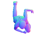
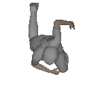
Yesterday I played with normal map rendering in Godot. It renders them just fine, but ones I made by hand sure are ugly. Fortunately, with some convincing, Blender can output normal maps just fine. So we have this nice human sprite to use instead of arrows. Sure, It’s just few clicks in MakeHuman, but now we can see actual proportions to play with.
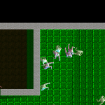
Sprites actually do look promising, If bit big – combat with 50 characters on this scale will probably get too chaotic. Perhaps we could go with half that size? I’ll need to ponder upon this. If we’ll go with this direction, the sprite should be sliced into parts – there is a need for separate movement of head, upper and lower body. But for mockups and early testing this will do just fine.
In next days I’ll focus on making more pre-rendered assets, so game will actually start looking more like a game, and less like a bunch of arrows on green texture. That helps both focus and motivation.


